Page 1 of 3
New MAIW Logo Wanted
Posted: 04 Jun 2009, 03:54
by MIKE JG
This is an open solicitation to anyone and everyone who would like to help us with the creation of a new MAIW logo. While the ones we have now are fine, as we continue to evolve into the future, we'd like to keep things fresh around here. Eventually we will be migrating to a new version of the forums which will bring us into the year 2009 as far as the forums go. Some new logos to go with that migration would be nice to have.
So if anyone out there reading this has some mad graphic design skills and would like to help us out, we'd love to see what you can come up with. There are no real limitations, the sky is essentially the limit. Your creativity is the only real limitation.
The reward is the same as it is for all the contributors and staffers, just personal satisfaction.
You can attach your logo ideas here for all to see. Maybe we could even vote for the favorites.
There is no time deadline, just like we always say about the packages, it's ready when it's ready.
Thanks in advance.

Posted: 04 Jun 2009, 16:36
by nickblack423
Here are a couple of my entries Mike. Just a couple of quick ones put together.
Nick
Posted: 04 Jun 2009, 18:07
by Mike_UKMIL
Posted: 04 Jun 2009, 18:20
by nickblack423
Wow that is excellent Mike.
Nick
Posted: 04 Jun 2009, 18:29
by Mike_UKMIL
Thanks; I've been making logos for a few companies and websites lately, so I thought it was worth entering something for this. I'll see if I can come up with a few more ideas.
Posted: 04 Jun 2009, 19:36
by campbeme
Here is my go.
Mark

Posted: 04 Jun 2009, 20:05
by djnocturnal
Here is my submission, perhaps more of a banner maybe.
Image is transparent and any background color can be applied.


Posted: 04 Jun 2009, 21:06
by djnocturnal
OK, last one...gotta get to work soon

using the same images from above.

Posted: 04 Jun 2009, 21:19
by MIKE JG
Now we're talking!
Again please don't feel like this is a competition. We'll use them all if we can. Looking great so far.
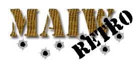
Nick, love the retro one!
Mark I see you didn't waste any time getting that Blue Angel in there!
Posted: 04 Jun 2009, 21:44
by Mike_UKMIL
Alternate design:


And one more:

Posted: 05 Jun 2009, 16:06
by sprocky
MIKE JG wrote:Again please don't feel like this is a competition.
But if it
was I knew my favourite already.
Just in case comments/critics welcome - otherwise skip the next lines and go ahead with the next post

@djnocturnal
The blue one is lovely. Blue = Sky
Your bigger one: A different font for the black letters may be better. Also, although I like it how you integrated the aircraft pics into the MAIW letters I guess some may become invisible when it is used in smaller sizes.
@Mike
Not bad at all - keep it simple! Have a look at well known logos: Volkswagen, GE, Boeing, etc.
@Nick
I knew you are a good modeller but did not recognize you being a logo creator

Posted: 05 Jun 2009, 16:11
by nickblack423
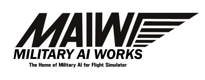
I showed these to My missus and she commented that the simple and clever approach of the one that Mike did is something that could easily be printed onto a T-shirt and be easily recognisable anywhere. Thats my pick already...I'm going to give a couple more a bit of a go but in my opinion Mike_UKMILs version is the winner already LOL.
Nick
Posted: 05 Jun 2009, 17:10
by Firebird
Damn, all this means a new logo for our factory in the Caribbean.
Posted: 05 Jun 2009, 17:25
by Jumpshot724
I liked having the wings like our old logo. Anybody come up with a new wing design??
Otherwise I'm torn for favorites....
Posted: 05 Jun 2009, 17:34
by Greg
Mike's first one with the jet as letter A would definately be my choice as well for now. Very professional looking!
I also like the banner idea from djnocturnal with all the small planes, but only as a banner.
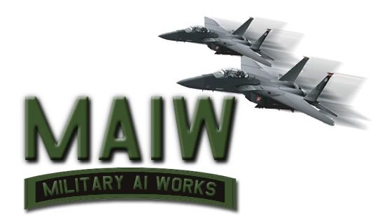
And Nick I love the feeling of speed you get from that pair of F-15's!
This is fun
Keep 'em coming guys!
Greg
Posted: 05 Jun 2009, 19:18
by nickblack423
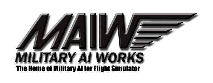
OK here's a stylised Logo with a new design of Wing....
Nick
Posted: 05 Jun 2009, 19:31
by Firebird
I like that. What I think would improve it is if the main logo is metallic black and it and the title have a shadow applied like our current logo.
It might be worth seeing what it looks like in the 3d embroidered look as well.
Then again I hardly qualify as an art critic.
Posted: 05 Jun 2009, 19:34
by Mike_UKMIL
nickblack423 wrote:I showed these to My missus and she commented that the simple and clever approach of the one that Mike did is something that could easily be printed onto a T-shirt and be easily recognisable anywhere.
That's what I'm going for; it's a sort of a template that allows for it to be used in several ways; for example, mimicking the current logo's applications:


I made a small change, just bringing the "T" and "A" in "military" closer together because they looked a bit odd before:

Also, wings?

I do like the wings that Nick made; mind if I copy them over to my logo?
Posted: 05 Jun 2009, 19:39
by theoklahomaaviator
Even if you hadn't used the Tomcat (Which I REALLY LIKE) I really really like the font you are using there. Provides a pretty bold base no matter what the background contains.
-Adam
Posted: 05 Jun 2009, 19:44
by nickblack423
OK I 've had a little play with it...what do you think to this?
Nick
